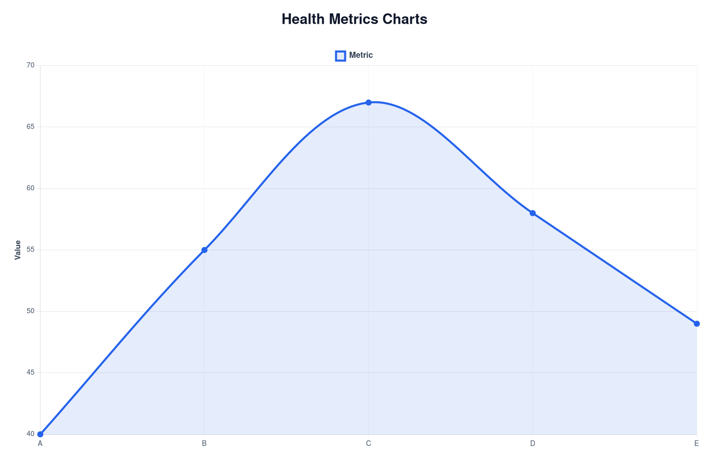
Health Metrics Charts
Wearable devices generate many health metrics. Charts help interpret these numbers by comparing them with common ranges.


Understanding Health Metrics Charts: A Guide to Your Wellness Data
In an era where health consciousness is becoming more prevalent, the use of wearable health technology has surged, providing individuals with valuable insights into their physical activity, heart rates, sleep patterns, and overall well-being. Central to this data is the concept of Health Metrics Charts—visual representations of health-related statistics. This article will delve into the meaning of health metrics charts, how to interpret them, their relevance in the wearable tech landscape, and their practical uses.
What are Health Metrics Charts?
Health metrics charts are graphical representations of health data collected over time, typically presented in the form of graphs or tables. These charts display various health metrics, such as:
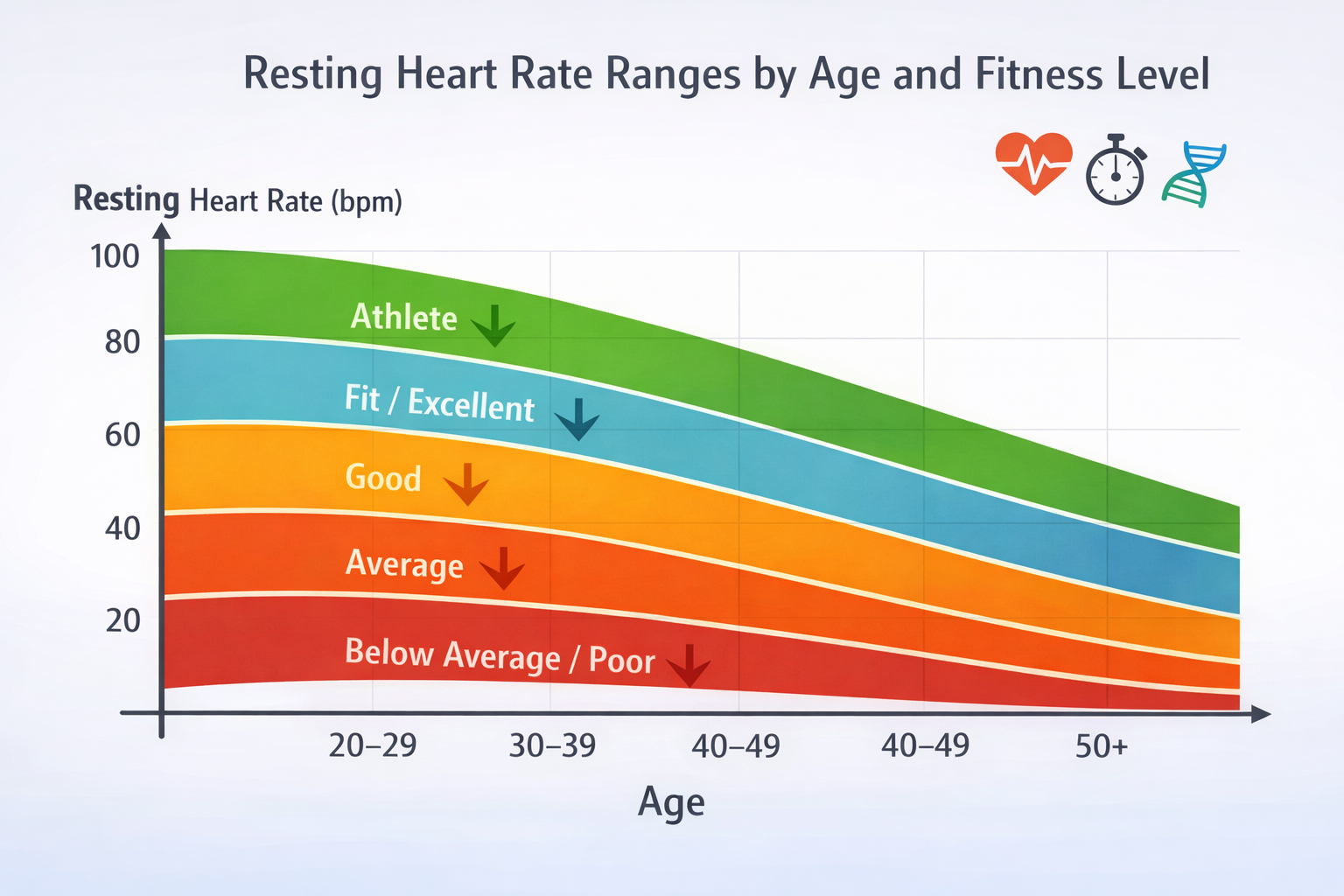
- Heart Rate: Measurements taken over time to showcase resting, active, and recovery heart rates.
- Activity Levels: Data showing physical activity, often tracked in steps, intensity, or calorie expenditure.
- Sleep Patterns: Information regarding sleep quality and duration, including metrics on deep sleep and REM cycles.
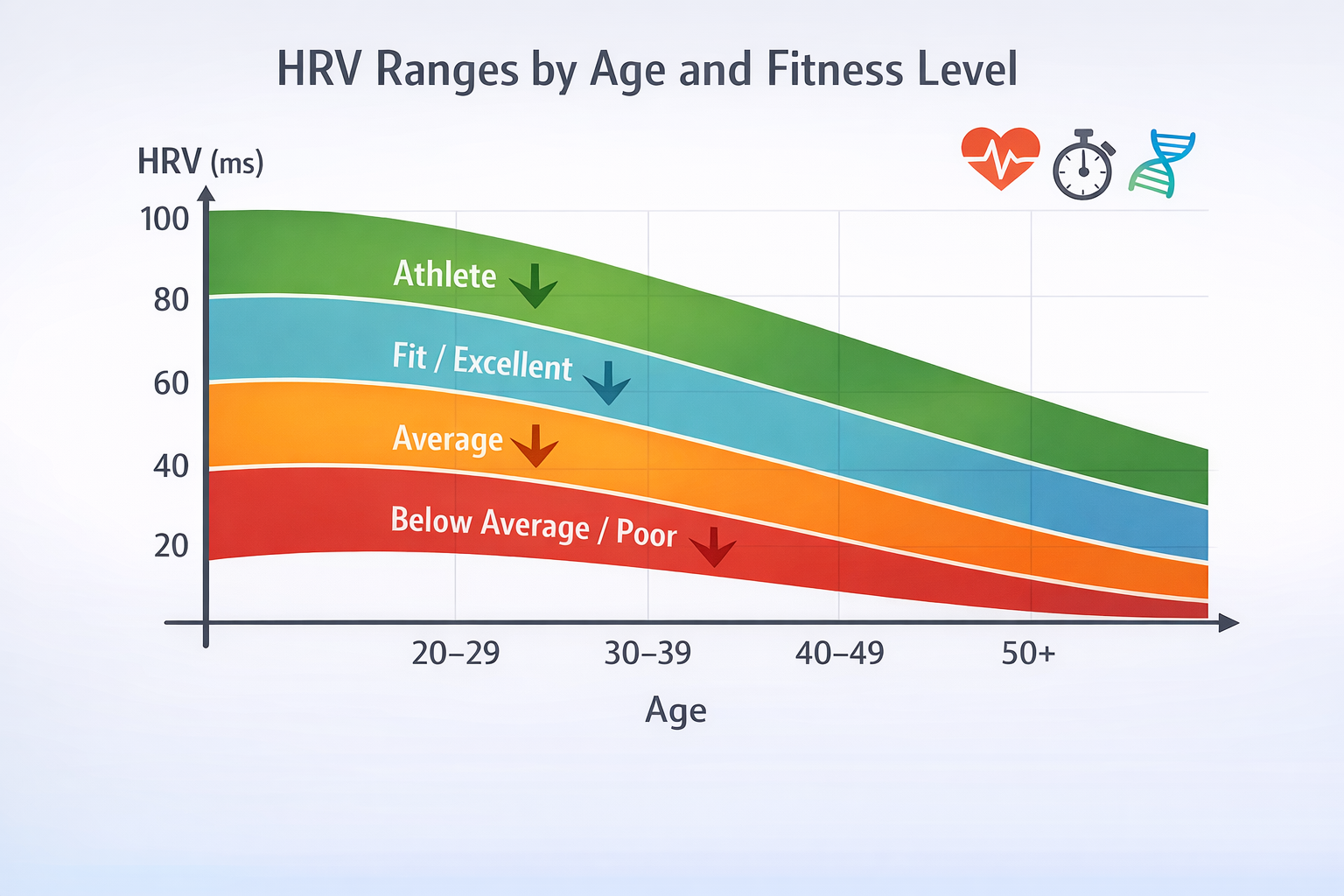
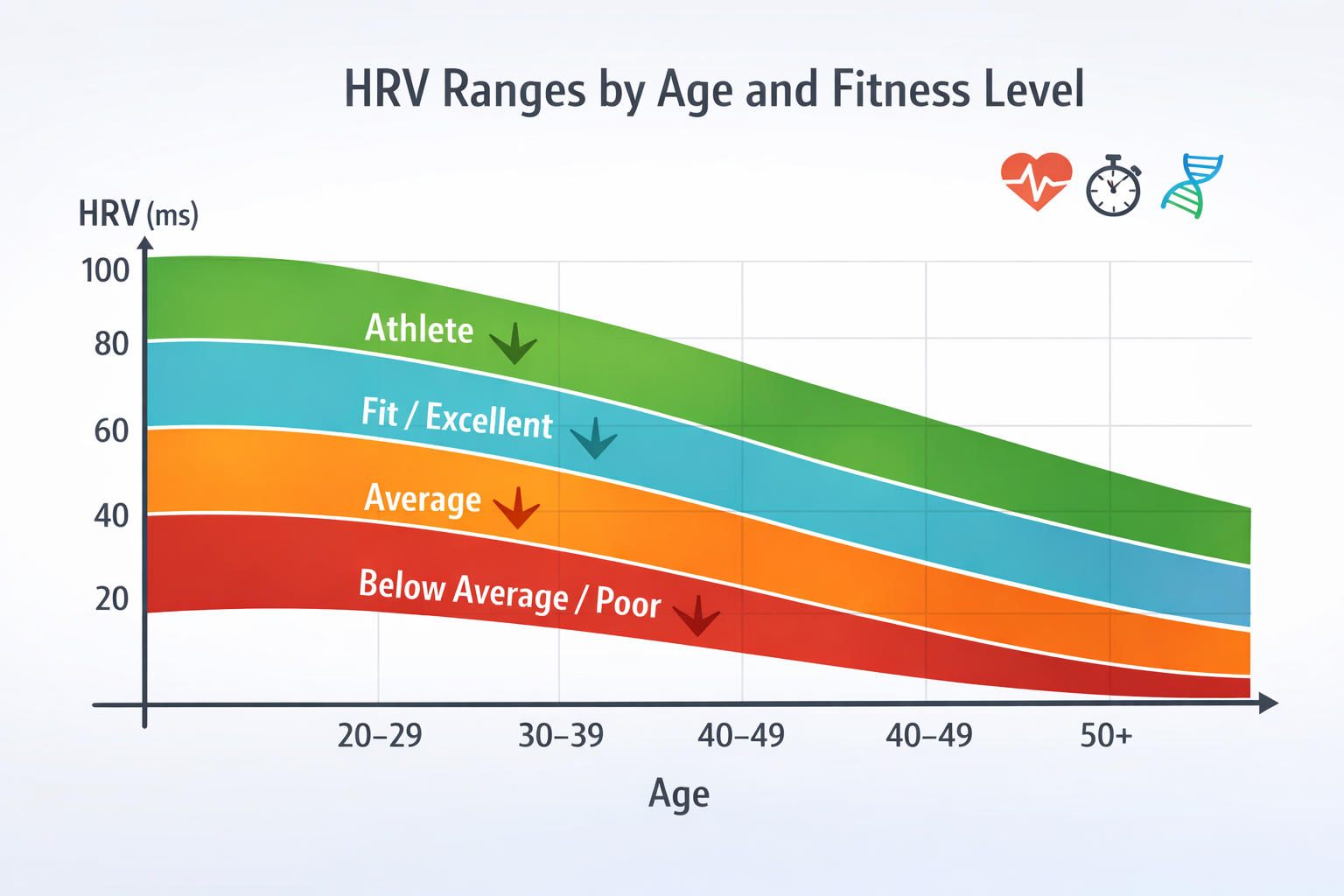
- Stress Levels: Indicators that represent physiological markers of stress, often derived from heart rate variability (HRV).
- Body Composition: Metrics related to muscle mass, fat percentage, and hydration levels.
By aggregating these diverse metrics into comprehensible charts, users can monitor their health and fitness progress, making informed decisions that can enhance their well-being.
Interpreting Health Metrics Charts
Understanding how to read and interpret health metrics charts is crucial in leveraging the data for health improvements. Here are some key factors to consider:
-
Time Frames: Most wearable devices allow data tracking over various time periods—daily, weekly, or monthly. Recognizing trends over time is essential. For example, you may notice increased physical activity during certain months, which can be encouraging.
-
Baseline Measurements: Understanding what your typical range is for each metric enables you to recognize significant deviations. A sudden spike or drop in heart rate, for example, may indicate stress or overtraining.
-
Comparative Analysis: Use different health metrics in conjunction. For instance, analyze your sleep patterns alongside activity levels to see if increased exercise positively influences sleep quality.
-
Goal-setting: Charts can help set realistic and achievable health goals. For instance, if your activity level is consistently below your target, charts can inform your strategy for increasing your daily steps.
Wearable Relevance
Wearable technology bridges the gap between data collection and user interaction. Popular devices like smartwatches, fitness trackers, and health monitors come equipped with advanced sensors that capture an array of health metrics.
Why Health Metrics Charts Matter in Wearables:
- Real-Time Monitoring: Wearables provide real-time feedback, allowing you to make adjustments on the fly—be it increasing workout intensity or focusing more on recovery.
- Customization: Users can customize the metrics they prioritize, tailoring their health journey according to personal objectives.
- Engagement: Visual data representation through charts encourages users to engage more with their health. The feedback loop created keeps individuals motivated to improve their metrics.
- Health Management: For individuals with chronic health issues, wearables track critical health metrics that can be shared with healthcare providers, creating a data-driven approach to treatment.
Practical Uses of Health Metrics Charts
Incorporating health metrics charts into your routine can greatly enhance your understanding and management of your health. Here are practical uses:
1. Improving Exercise Routines:
- Use activity charts to identify which workouts increase your heart rate effectively.
- Adjust routines based on patterns, focusing on activities that yield the best results in terms of calorie burn and heart rate recovery.
2. Enhancing Sleep Quality:
- Analyze sleep patterns to identify factors affecting sleep quality, such as irregular sleep schedules or late-night activity.
- Implement changes, like developing a bedtime routine, and track progress through sleep quality charts.
3. Stress Management:
- Regularly monitor stress levels through heart rate variability metrics.
- Use this data to introduce stress-reducing practices like meditation, yoga, or deep breathing exercises, and observe their effects over time.
4. Setting and Tracking Goals:
- Set specific health goals based on trends observed in your charts, such as increasing weekly walk distance or improving average sleep duration.
- Track your progress against these goals, using the charts to visualize success and areas needing improvement.
5. Sharing Data with Healthcare Providers:
- Provide health metrics charts during consultations with healthcare professionals, facilitating informed discussions about your health and lifestyle.
- Collaborate on treatment plans and track changes more effectively with concrete data.
Conclusion
Health metrics charts serve as vital tools for understanding and enhancing your well-being, especially when combined with wearable technology. By interpreting these charts correctly, leveraging them for practical applications, and sharing valuable data with healthcare providers, individuals can take proactive steps in their health journey. Embrace these visual aids and empower yourself to lead a healthier and more informed life.
Understand Your Health Data
LongLife Scan analyzes wearable health data and helps you understand patterns in stress, sleep and recovery.
Try LongLife ScanRelated Metrics
Health Metrics
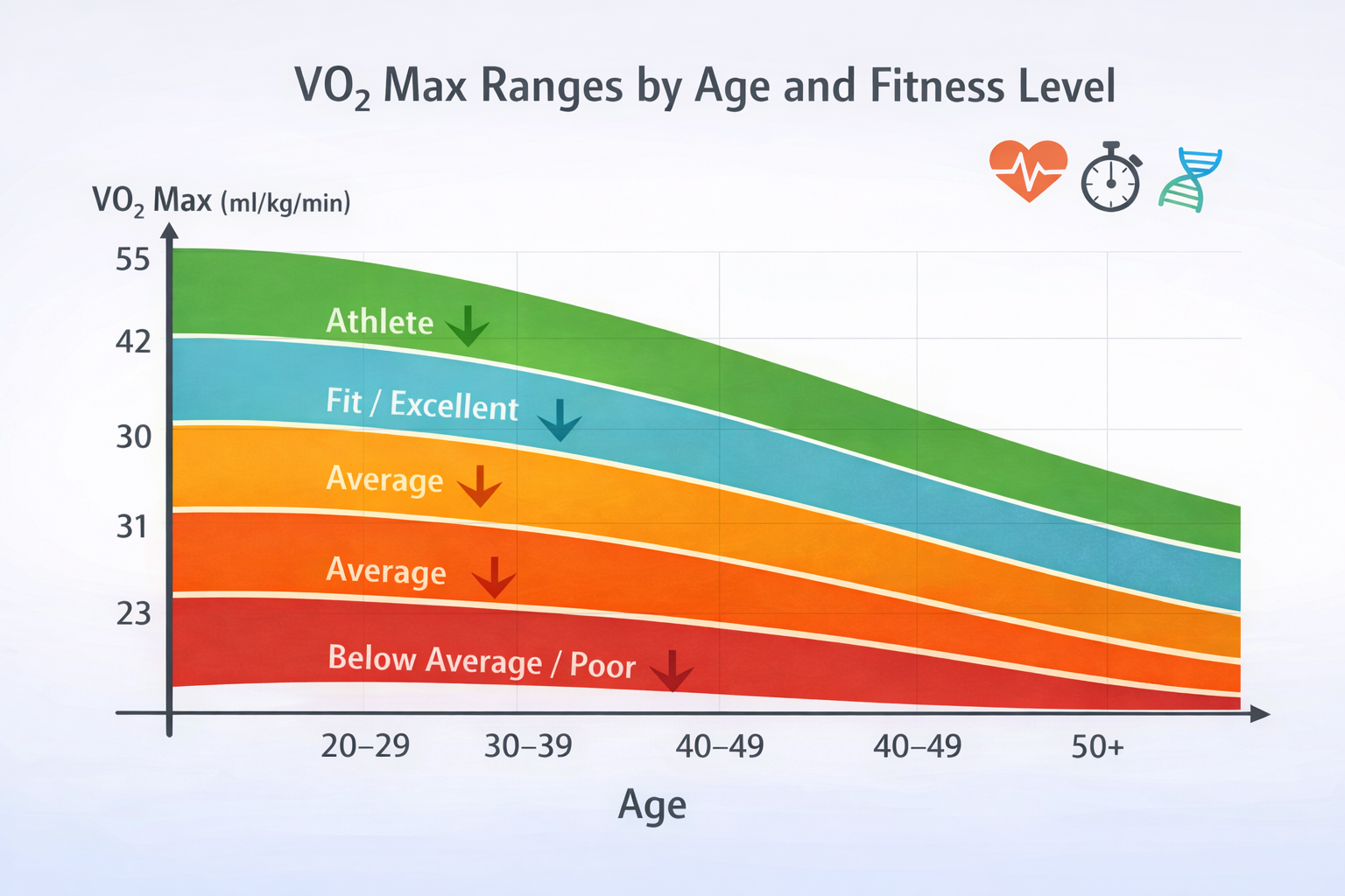
Overview of wearable health metrics including HRV, VO2max, sleep and recovery.
View Metric →
Related Charts
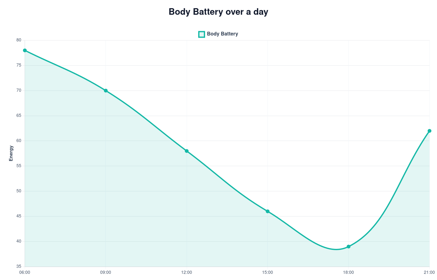
Body Battery Chart
Body Battery charts show how wearable devices estimate energy, recovery and stress patterns during the day.
View Chart →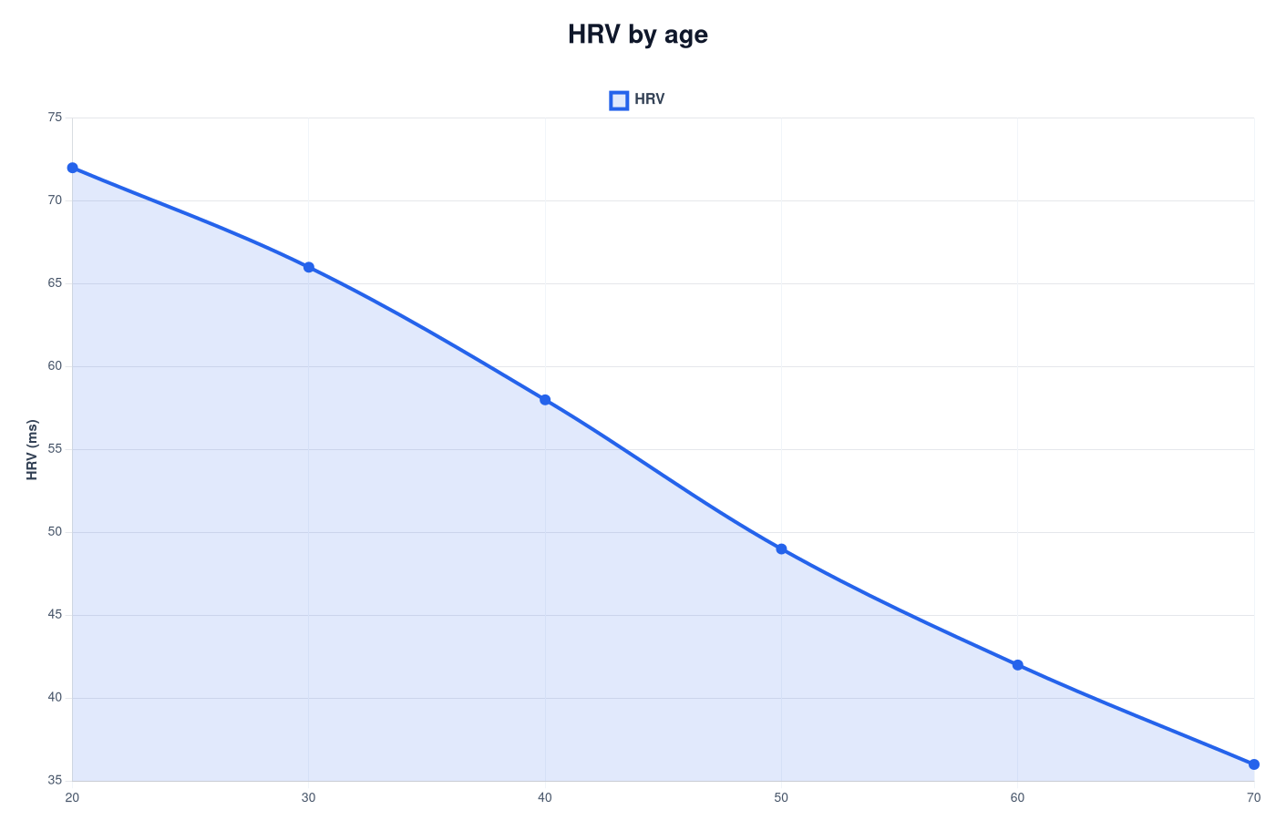
HRV Chart – Typical Heart Rate Variability Ranges
HRV trends show recovery and stress patterns over time.
View Chart →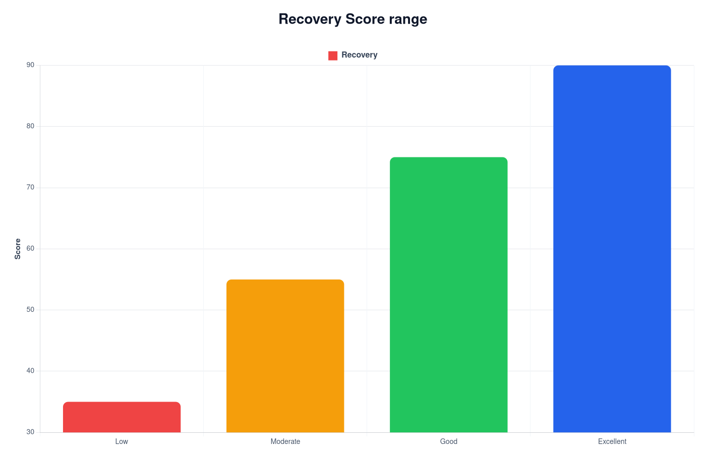
Recovery Score Chart
Recovery score charts show how wearables combine HRV, sleep and stress signals into one readiness value.
View Chart →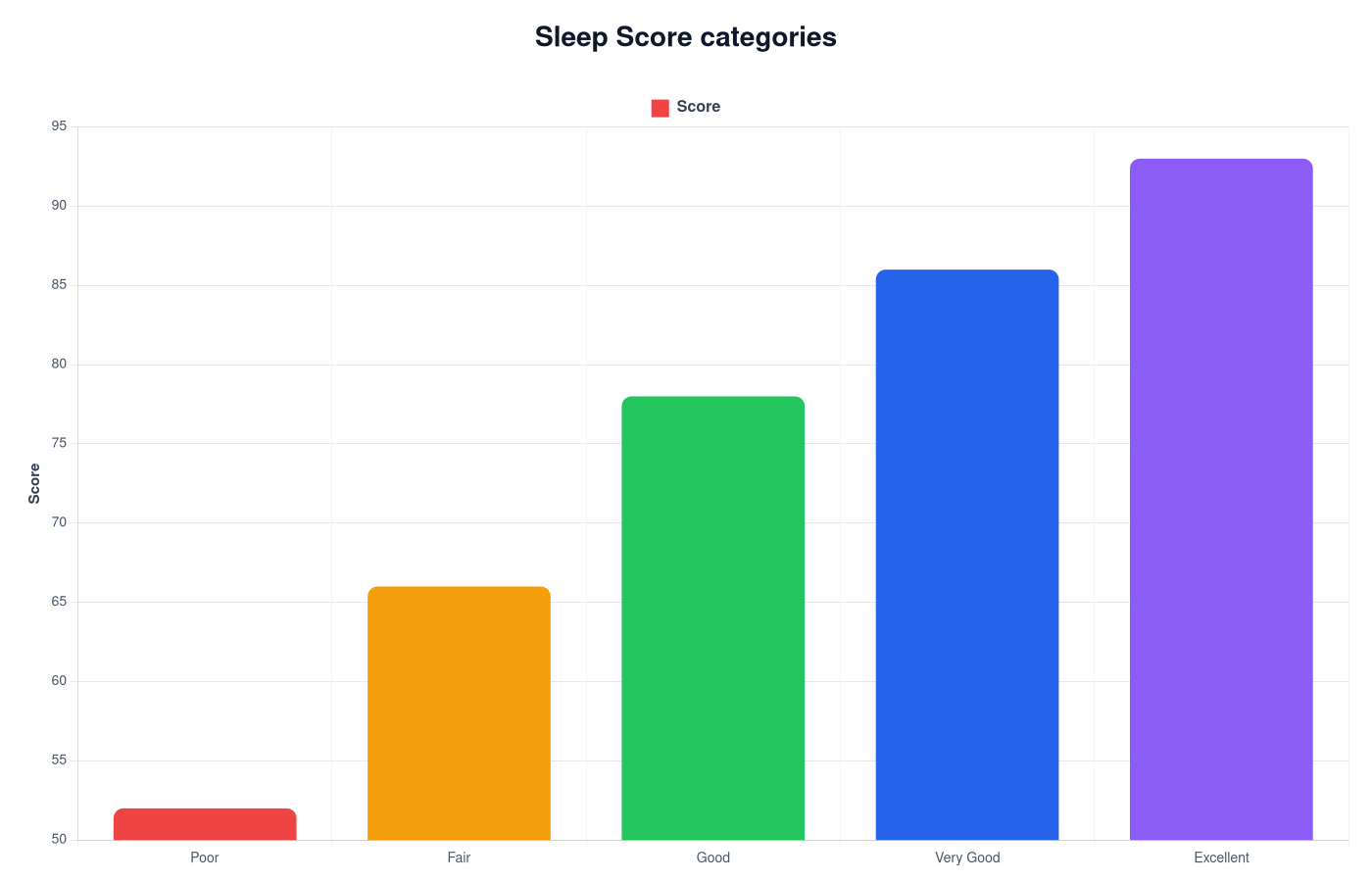
Sleep Score Chart – Sleep Quality Explained
Sleep score charts show typical score ranges and help interpret wearable sleep quality estimates.
View Chart →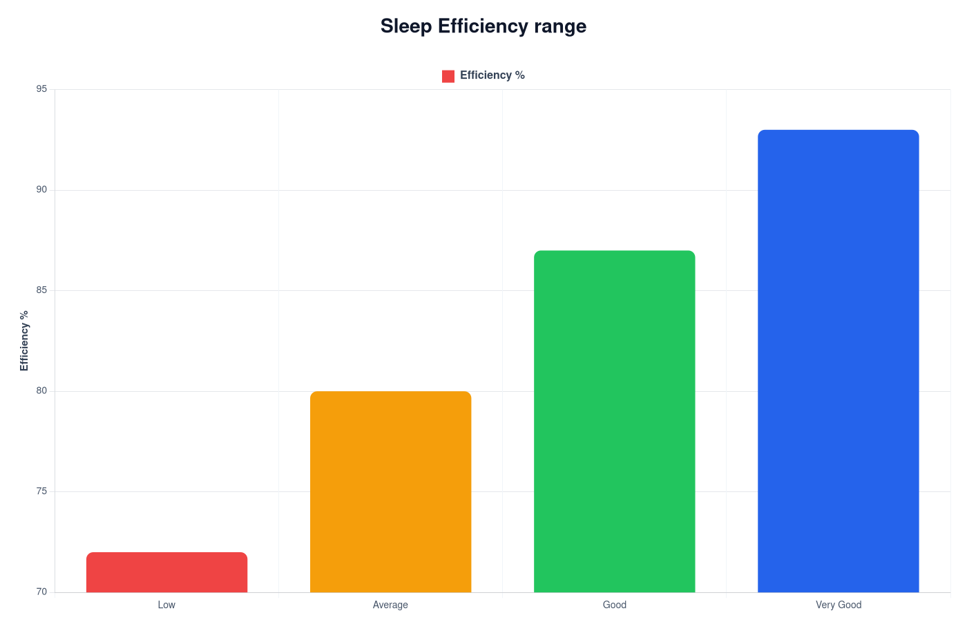
Sleep Efficiency Chart
Sleep efficiency charts show how much of your time in bed is spent sleeping and help interpret sleep continuity.
View Chart →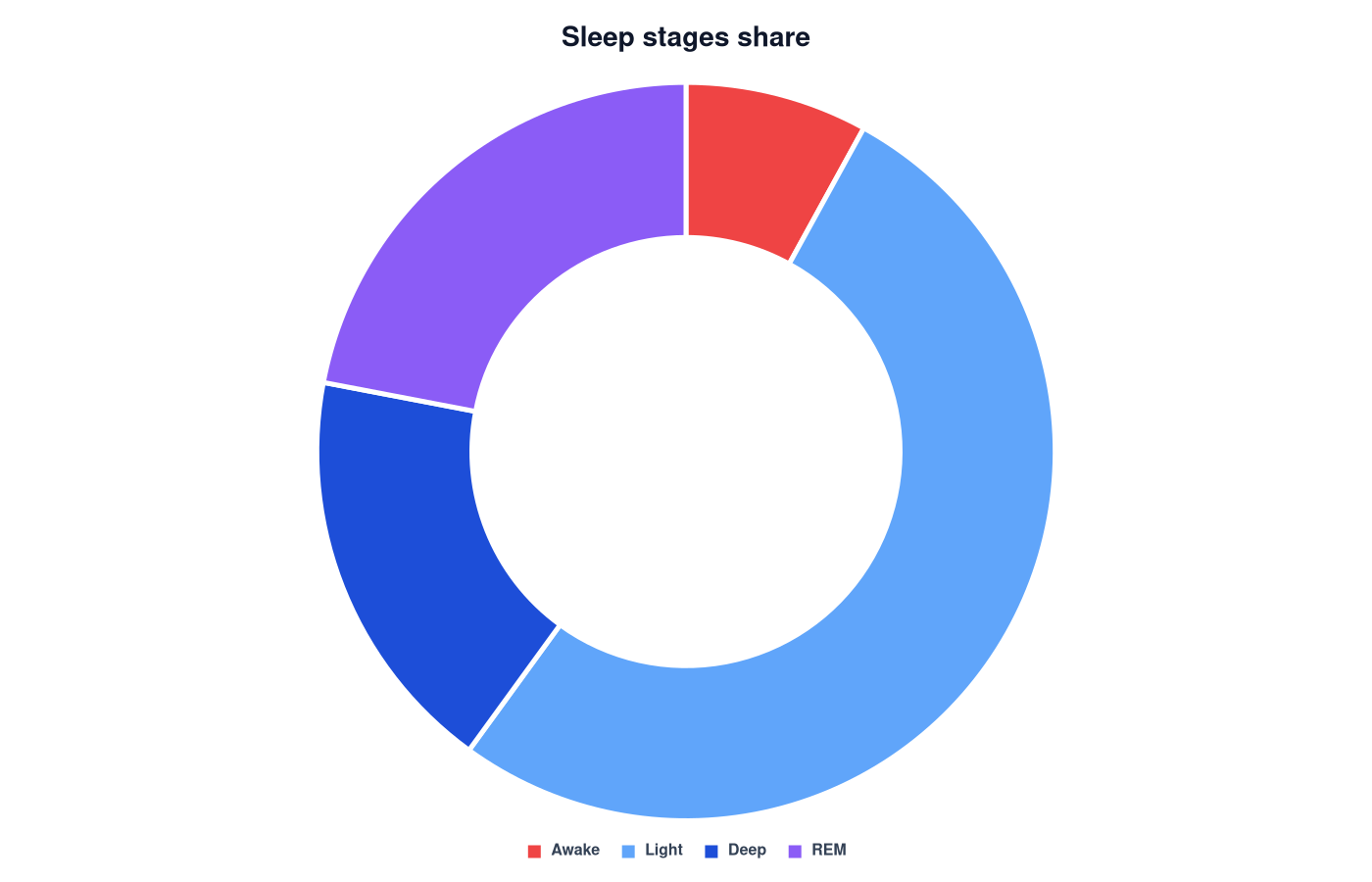
Sleep Stages Chart
Sleep stages charts show how sleep cycles are distributed between light sleep, deep sleep and REM sleep.
View Chart →