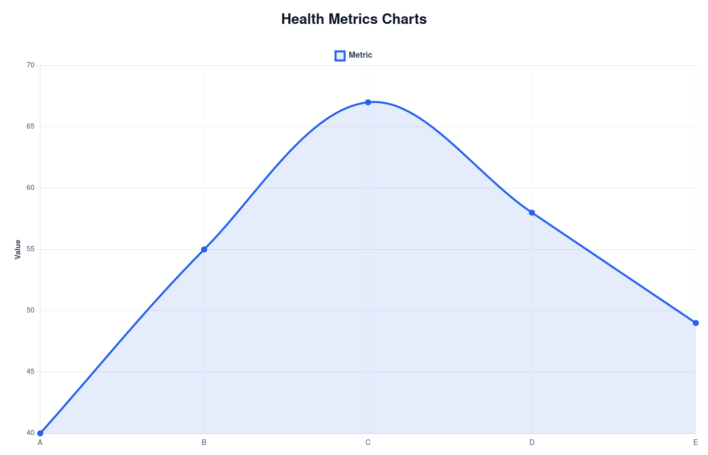
Health Metrics Charts
Wearable devices generate many health metrics. Charts help interpret these numbers by comparing them with common ranges.

Body Battery Chart
Body Battery values estimate how recovered or drained your body may be based on stress, sleep and activity.
View Chart →
HRV Chart – Typical Heart Rate Variability Ranges
HRV charts help compare heart rate variability values with common ranges observed in wearable health data.
View Chart →
Recovery Score Chart
Recovery scores estimate how ready your body is for activity based on multiple wearable metrics.
View Chart →
Sleep Score Chart – Sleep Quality Explained
Sleep score charts help interpret wearable sleep scores and sleep quality.
View Chart →
Sleep Efficiency Chart
Sleep efficiency measures how much of your time in bed is actually spent sleeping.
View Chart →
Sleep Stages Chart
Sleep stages show how your body cycles between light sleep, deep sleep and REM sleep during the night.
View Chart →
Stress Score Chart
Stress scores estimated by wearables reflect physiological stress signals derived from HRV and heart rate.
View Chart →
Training Load Chart
Training load estimates how much strain your workouts place on the body.
View Chart →
VO2max Chart – Aerobic Fitness Levels
VO2max charts help compare aerobic fitness levels using typical ranges measured in wearable devices.
View Chart →Understanding Health Metrics Charts: A Guide to Wellness Tracking
In our increasingly health-conscious society, understanding health metrics is essential for maintaining well-being. Health metrics charts serve as a key tool in visualizing and interpreting various health indicators, making it easier for individuals to track their progress over time. This article explores what health metrics charts are, how to interpret them, their relevance to wearable technology, and practical uses for everyday life.
What Are Health Metrics Charts?
Health metrics charts are visual representations of data related to health and wellness indicators. These charts compile various metrics such as heart rate, sleep patterns, activity levels, and even blood pressure readings into a single visual format, making it easier to analyze changes and trends over time. Common health metrics include:
- Heart Rate: Monitoring resting and active heart rates.
- Steps Taken: Tracking daily physical activity levels.
- Calories Burned: Estimating energy expenditure throughout the day.
- Sleep Patterns: Assessing duration and quality of sleep.
- Body Composition: Measuring fat vs. lean mass.
These metrics not only provide a snapshot of an individual's health but also facilitate deeper insights into lifestyle choices and their impacts on overall well-being.
How to Interpret Health Metrics Charts
Reading health metrics charts effectively requires an understanding of a few fundamental components. Here's how to interpret the information presented:
-
Axes: Health metrics charts often include two axes – the X-axis typically represents time (days, weeks, or months), while the Y-axis denotes the measured value (e.g., steps, heart rate).
-
Trends: Look for upward or downward trends. An increase in activity levels or a decrease in resting heart rate can indicate improved fitness, while consistent poor sleep patterns may reveal a need for lifestyle changes.
-
Comparisons: Many charts allow users to compare metrics side by side (e.g., sleep duration vs. activity levels). Observing these comparisons can help individuals identify factors affecting their health.
-
Benchmarks: Familiarize yourself with standard benchmarks for various health metrics (e.g., the CDC recommends at least 150 minutes of moderate aerobic activity weekly). This can help you assess whether your metrics fall within a healthy range.
-
Anomalies: Be on the lookout for sudden spikes or drops in metrics, which could indicate a health issue or changes in lifestyle habits that need addressing.
The Wearable Relevance of Health Metrics Charts
Wearable technology has revolutionized how individuals monitor their health. Devices like fitness trackers, smartwatches, and health monitors continuously gather a range of metrics, allowing users to visualize their data through health metrics charts. Here are some reasons why these charts are relevant for wearables:
-
Real-Time Tracking: Wearables provide data in real-time, offering immediate insights and enabling users to make timely adjustments to their routines.
-
Personalized Feedback: Many wearable devices allow customization of metrics that are most relevant to individual goals, from weight loss to stress management.
-
Integration with Health Apps: Wearable devices often sync with health applications, creating a seamless platform to view, analyze, and interpret health metrics charts.
-
Long-term Health Trends: Wearables enable prolonged tracking, allowing individuals to observe long-term health patterns, making it easier to identify progress or setbacks.
-
Alerts and Notifications: Advanced wearables can alert users to abnormal readings (e.g., exceptionally high heart rates), prompting timely action for potential health concerns.
Practical Uses of Health Metrics Charts
Health metrics charts can be applied practically in various aspects of life, driving better health choices and supporting wellness goals. Here are some everyday applications:
-
Goal Setting: Use health metrics charts to set SMART (Specific, Measurable, Achievable, Relevant, Time-bound) wellness goals such as increasing daily step counts or improving sleep quality.
-
Monitoring Progress: Regularly review charts to visualize progress. Are you consistently reaching your step goal? Has your sleep duration improved? Tracking these to milestones can serve as motivation.
-
Identifying Patters: Use charts to uncover health patterns. For instance, charting physical activity alongside weight fluctuations can reveal the impact of active days on weight management.
-
Adjusting Lifestyle: If your charts reveal chronic low sleep quality or inconsistent activity levels, it might be time to reassess your habits and consider sleep hygiene practices or a structured exercise regimen.
-
Sharing with Healthcare Providers: Having visual data on health metrics can facilitate more productive conversations with doctors, enabling informed decisions on health interventions.
Conclusion
Understanding health metrics charts can be incredibly beneficial in managing your well-being. These visual tools not only help track and assess health indicators but also encourage actionable insights into your lifestyle choices. With the growing relevance of wearable devices, these charts now play a vital role in everyday health monitoring, empowering individuals to take charge of their health in innovative ways. Engaging with your health metrics charts could very well be the key to unlocking your best self.
Recommended FITNESS Trackers
Understand Your Health Data
LongLife Scan analyzes wearable health data and helps you understand patterns in stress, sleep and recovery.
Try LongLife ScanRelated Metrics

Health Metrics
Overview of wearable health metrics including HRV, VO2max, sleep and recovery.
View Metric →
Related Charts
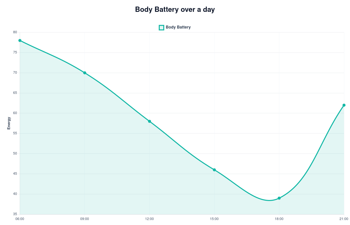
Body Battery Chart
Body Battery charts show how wearable devices estimate energy, recovery and stress patterns during the day.
View Chart →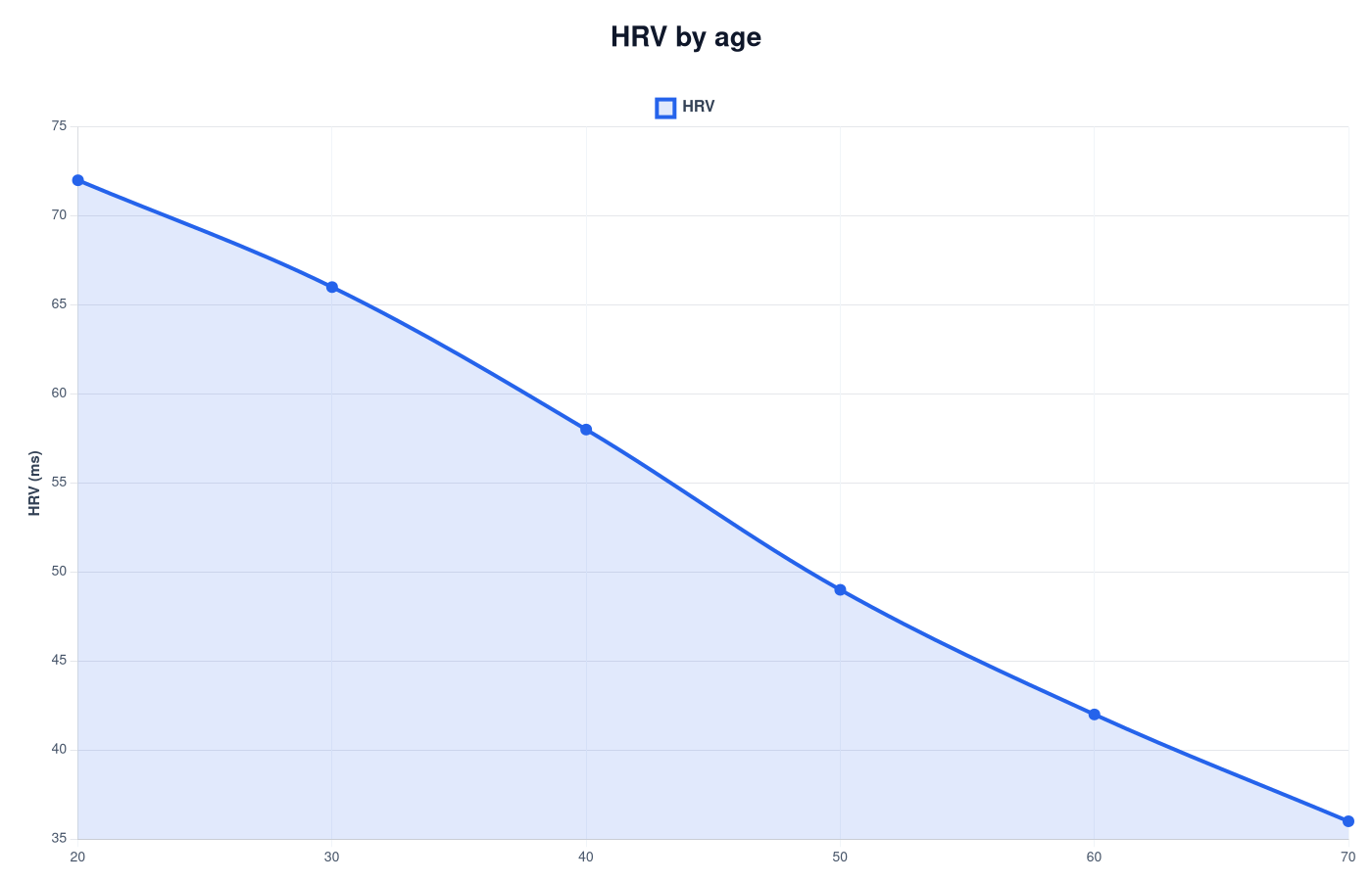
HRV Chart – Typical Heart Rate Variability Ranges
HRV trends show recovery and stress patterns over time.
View Chart →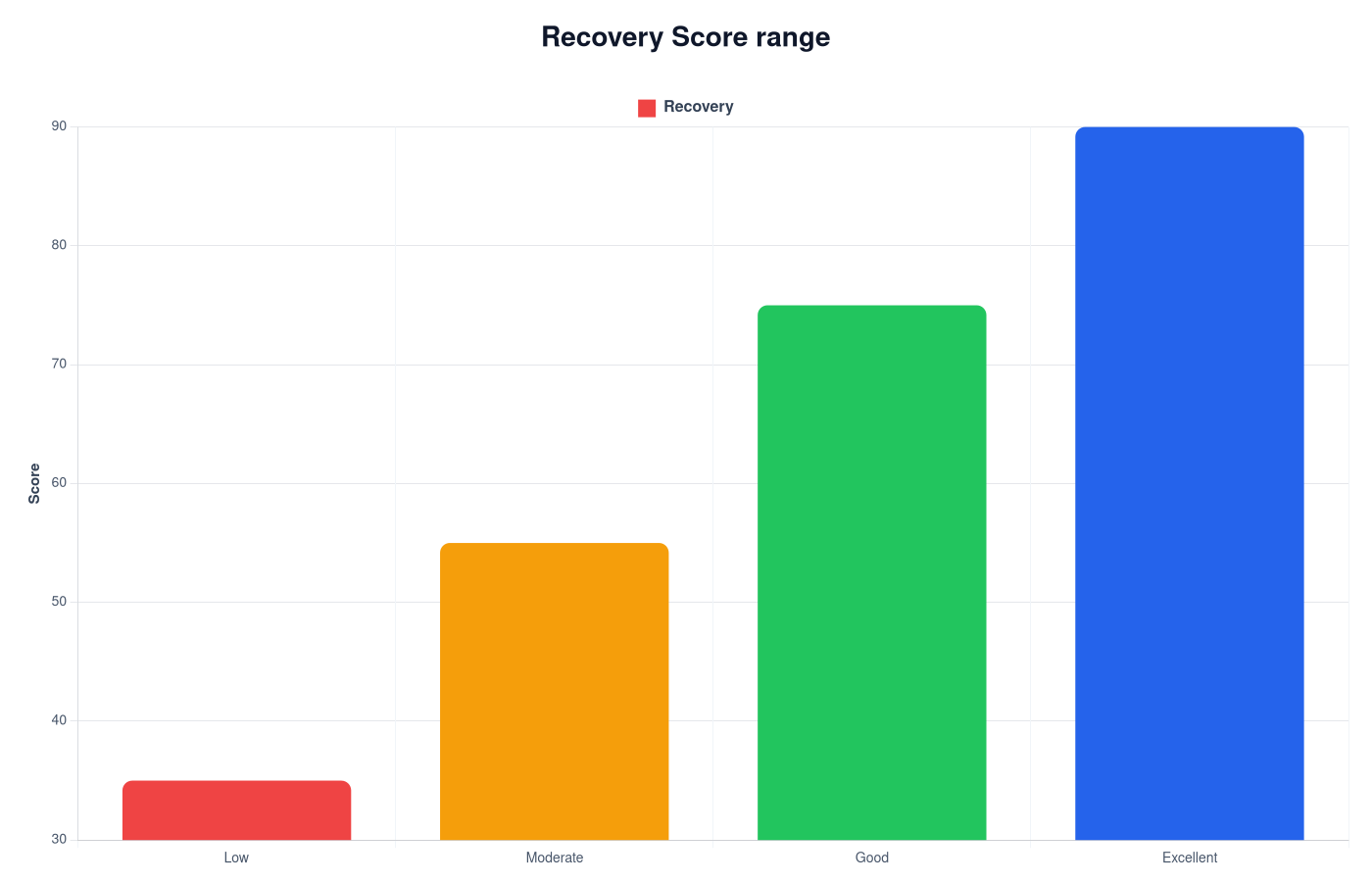
Recovery Score Chart
Recovery score charts show how wearables combine HRV, sleep and stress signals into one readiness value.
View Chart →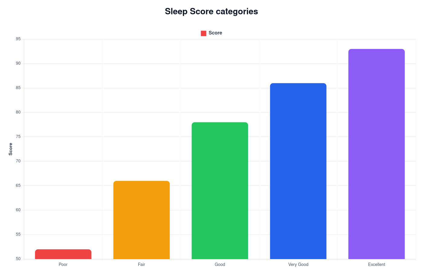
Sleep Score Chart – Sleep Quality Explained
Sleep score charts show typical score ranges and help interpret wearable sleep quality estimates.
View Chart →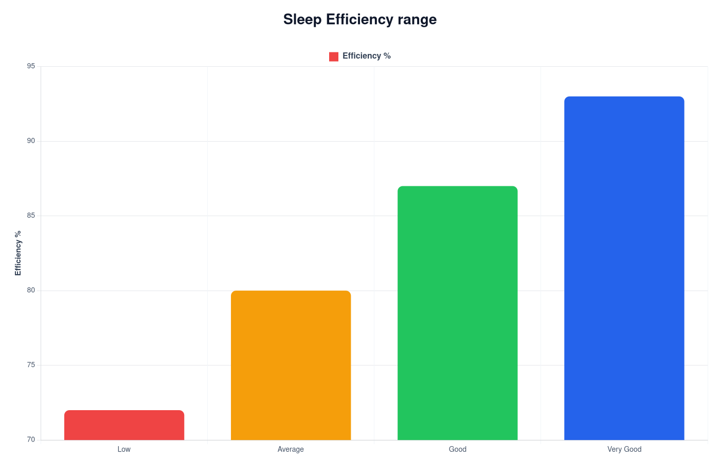
Sleep Efficiency Chart
Sleep efficiency charts show how much of your time in bed is spent sleeping and help interpret sleep continuity.
View Chart →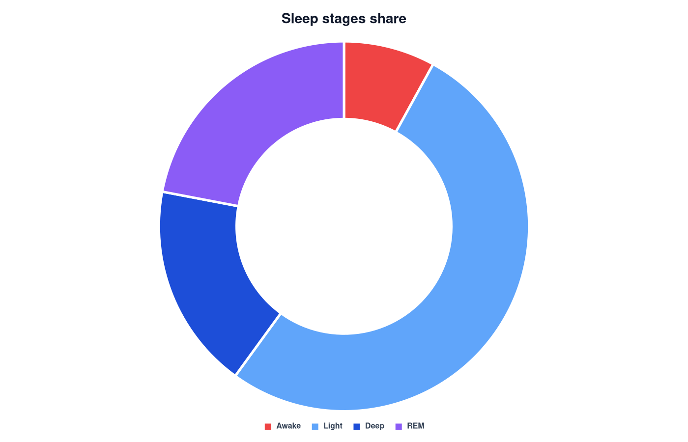
Sleep Stages Chart
Sleep stages charts show how sleep cycles are distributed between light sleep, deep sleep and REM sleep.
View Chart →